- CompressConvertAI PDF
- Organize
- View & Edit
- Convert from PDF
- Convert to PDF
- SignMoreScan
What Font Is Best for PDF Certificates?
Choose the perfect fonts for your certificates with expert recommendations for serif, sans-serif, and script options plus editing tips.
Choosing the right font for a certificate does more than make it look nice. It sets the tone for recognition and credibility. Classic serif fonts like Garamond or Baskerville feel formal and traditional, while clean sans-serif fonts such as Arial or Helvetica work well for modern, digital-first certificates.
The font you choose should match the purpose, whether it’s an academic diploma, a professional award, or a course completion certificate.
Certificates are often created in Word, Google Docs, or design tools, then exported to PDF for sharing or printing. Sometimes, you’re working with an existing PDF that needs a font update to look more polished or aligned with your branding.
This guide covers the best fonts for certificates, how they perform in both print and digital formats, and how to edit the font in your PDF certificates directly using Smallpdf, without rebuilding the document from scratch.
Quick Font Picks for Common Certificate Types
Here’s the recommended fonts for different certificate types and why they work.
| Certificate type | Recommended fonts | Why they work |
|---|---|---|
| Academic diplomas | Garamond, Baskerville, Trajan Pro | Traditional, formal, and widely accepted |
| Professional awards | Baskerville, Times New Roman, Helvetica | Credible and easy to read in print |
| Digital certificates | Arial, Helvetica, Calibri | Clean on screens and reliable across devices |
| Recipient names | Great Vibes, Alex Brush | Adds emphasis without overpowering the layout |
Best Fonts for Certificates
Choosing the right font impacts how official, elegant, and memorable your certificate feels. Here are the top font categories that work best for different types of certificates:
Serif Fonts for Traditional Certificates
Serif fonts—those with small decorative strokes—convey tradition, formality, and prestige. They’re perfect for academic diplomas, professional awards, and formal recognition documents.
Garamond: A timeless choice with elegant strokes and classic letterforms, ideal for certificates of achievement and academic awards.
Baskerville: Known for its refined appearance with clean lines and crisp serifs that add authority without being distracting.
Times New Roman: A highly legible serif that’s widely recognized and works well for official documents requiring maximum readability.
Trajan Pro: Inspired by Roman inscriptions, this all-caps font provides a sense of tradition and works best for headings and titles.
Sans-Serif Fonts for Modern Certificates
Sans-serif fonts offer clean, simple lines that work especially well for digital certificates and contemporary designs. They’re highly readable on screens and maintain clarity at various sizes.
Arial: A versatile, widely-used font that’s excellent for digital certificates and offers great OCR recognition for scanned documents.
Helvetica: A sleek, modern font with excellent legibility that works well for both digital and print certificates.
Calibri: A professional, easy-to-read option that’s become standard in many business applications.
Raleway: A clean font with good spacing that adds a contemporary feel to certificates.
Script and Calligraphy Fonts for Elegant Certificates
In general, you should only use Script fonts for recipient names, signatures, or decorative elements. They add elegance but can reduce readability if overused.
Great Vibes: A flowing, handwritten-style font perfect for highlighting recipient names while maintaining readability.
Alex Brush: An elegant script that works well for signature lines and special emphasis.
Pacifico: A friendly script font that adds personality while remaining professional.
How to Choose the Best Certificate Font
Beyond appearance, a good certificate font needs to stay readable, credible, and consistent, no matter how the certificate is created or shared.
Readability and Visual Hierarchy
Your certificate should be easy to read at various sizes and distances. It creates a clear hierarchy by using different font sizes. Titles should be 20-50 points, recipient names 14-30 points, and body text 10-14 points.
Print vs Digital Considerations
Serif fonts often look better in print, while sans-serif fonts tend to be more readable on screens. If your certificate will be viewed primarily digitally, lean toward clean sans-serif options.
Font Pairing and Contrast
When combining fonts, pair a serif with a sans-serif for contrast, or use different weights of the same font family. Avoid pairing two similar serif fonts or two decorative fonts together.
Limit Your Design to 2-3 Fonts
Too many fonts create visual chaos. Stick to one primary font for body text, one for headings, and optionally one script font for names or signatures.
These guidelines apply to certificates created in any format, including Word documents, design templates, and files that will later be exported to PDF.
Best Fonts by Certificate Use Case
Different types of certificates call for different font approaches. Here’s how to match your font choice to your certificate’s purpose:
Fonts for Diplomas and Academic Certificates
Academic certificates benefit from traditional serif fonts that convey scholarly authority. Baskerville, Garamond, and Times New Roman are excellent choices that universities commonly use for diplomas.
Fonts for Certificates of Appreciation
Awards and appreciation certificates can balance formal and friendly elements. Consider pairing a clean serif like Baskerville for the main text with a script font like Great Vibes for the recipient’s name.
Fonts for the Recipient’s Name
The recipient’s name should stand out as the most important element. Use a larger font size, bolder weight, or elegant script font to give it prominence while maintaining readability.
Fonts for Modern Digital Certificates
Digital certificates that will be viewed on screens work best with sans-serif fonts like Arial, Helvetica, or Calibri. These fonts maintain clarity at various screen sizes and resolutions.
How to Edit Fonts on Your PDF Certificate
Ready to update your certificate fonts? Here’s how to do it using Smallpdf’s PDF Editor:
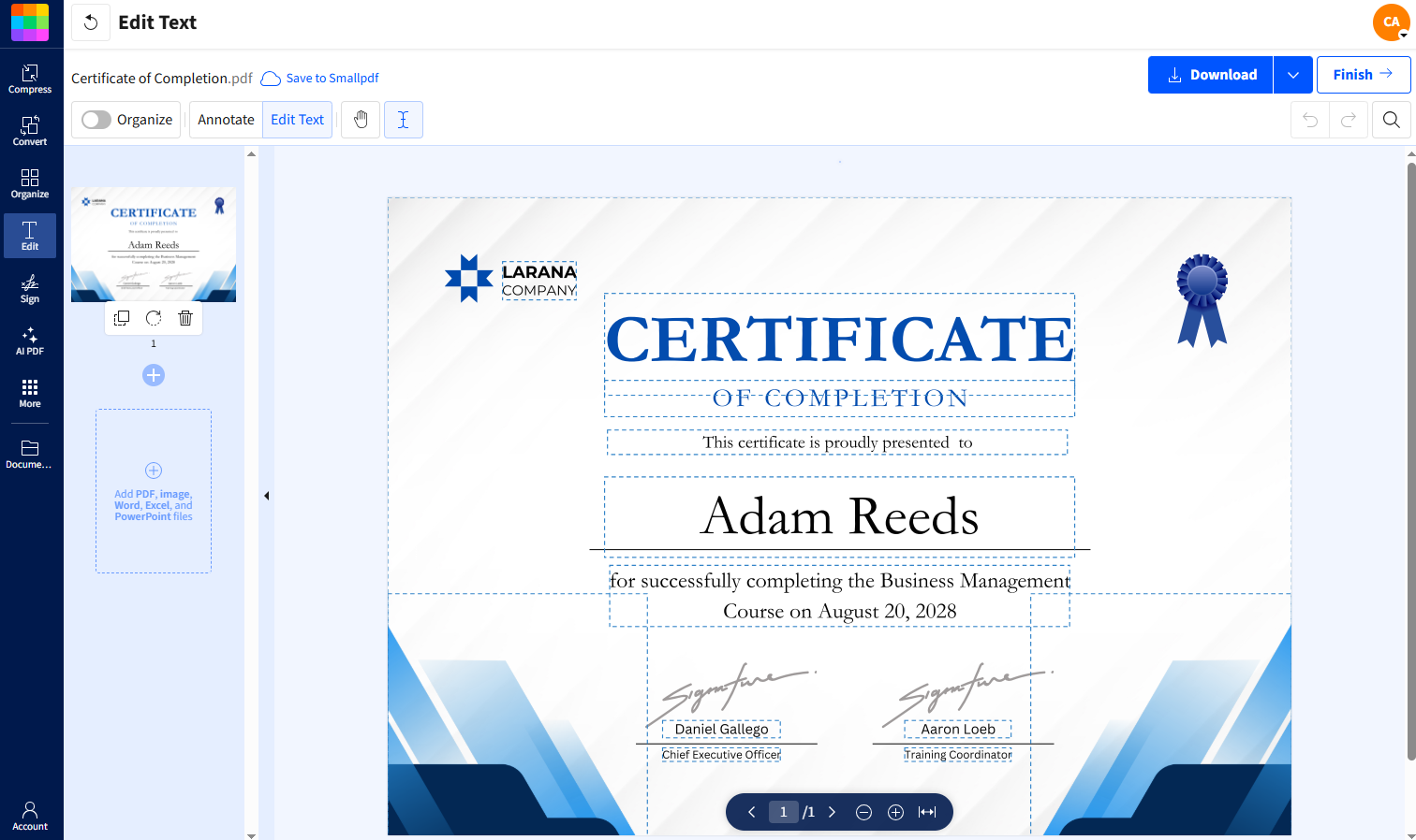
Step 1: Upload Your Certificate to Smallpdf
Go to our PDF Editor tool and upload your PDF certificate. You can drag and drop the file or click “Choose Files” to select it from your device.
Step 2: Select and Edit Text
Once your certificate loads, click the “Edit Text” button in the toolbar. This highlights all editable text areas. Click any text box to see font options. You can change the font style, size, color, and alignment.
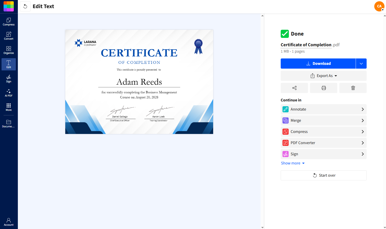
Step 3: Save and Share Your Certificate
After editing your fonts, click “Download” to save the updated PDF to your device. You can also use the “Finish” button to access additional sharing and export options.
Make Scanned and Finished Certificates Editable
If you’re working with scanned certificates or older files, Smallpdf’s OCR tool can turn them into editable PDFs. That makes it possible to update fonts, names, or layouts without recreating the certificate from scratch. It’s especially useful when you need to modernize large batches or bring older designs back into line.
Once your certificate text is editable, other Smallpdf tools help with the final steps:
Edit PDF to adjust fonts, spacing, and alignment.
Convert PDF to move between Word and PDF if you need to make broader layout changes.
Compress PDF to reduce file size before emailing or uploading certificates.
Sign PDF to add authorized signatures without printing or scanning.
Together, these tools cover the full certificate lifecycle, from updating text to securely sharing the final version. For details on how files are handled and protected, you can review Smallpdf’s Trust Center.
Try Smallpdf free to access PDF editing, OCR, conversion, compression, and Sign PDF tools with no cost or commitment.
Want to Edit Your PDF Certificates?
Frequently Asked Questions
What is the best font for certificates?
The best font for certificates depends on the tone you want to convey, but classic serif fonts like Garamond, Baskerville, and Trajan Pro are popular choices. These fonts offer a formal and prestigious appearance, making them ideal for awards, diplomas, or official recognitions.Do certificates need paid fonts to look professional?
No. Many certificates use free or built-in fonts and still look professional. Well-designed system fonts like Times New Roman, Arial, Calibri, and Garamond are widely accepted for academic and professional certificates. Paid fonts can add personality or branding consistency, but they’re not required for a credible result.What font do most universities use for diplomas?
Most universities use traditional serif fonts like Baskerville, Garamond, or Times New Roman for diplomas. These fonts convey academic authority and have been standard in higher education for decades.Should I use system fonts or download new fonts for certificates?
System fonts are usually the safest choice for certificates. They’re supported across devices and tools, which helps prevent layout changes when files are opened, edited, or converted to PDF. Downloaded fonts can work well, but only if they’re properly licensed and embedded when exporting the final certificate.Which font size is best for an experience certificate?
The ideal font size for an experience certificate is typically between 11 and 13 points for the body text. This range ensures the content is easy to read without appearing too cramped or oversized. Headings can be larger, around 16 to 20 points, to create a clear visual hierarchy.Can I use multiple fonts on one certificate?
Yes, but limit yourself to 2-3 fonts maximum. Use one font for body text, another for headings, and optionally a script font for names or signatures.Do font licenses matter when creating certificates?
Yes. Some fonts are free for personal use but require a commercial license for official certificates, training programs, or workplace documents. If certificates are issued by an organization or used publicly, check the font’s license terms before using it. System fonts typically don’t raise licensing issues.What is the best signature font for certificates?
The best signature fonts for certificates mimic real handwriting while maintaining a polished look. Popular options include Great Vibes, Allura, and Pacifico, which are highly readable.What’s the difference between serif and sans-serif for certificates?
Serif fonts have small decorative strokes and convey tradition and formality, making them ideal for academic certificates. Sans-serif fonts are cleaner and more modern, working better for digital certificates and contemporary designs.What is the best font for official documents?
Times New Roman, Calibri, and Arial are commonly used for official documents because they convey formality and are compatible with most software. These fonts maintain clarity in both digital and printed formats.How do I make text stand out on a certificate?
Make important text stand out by increasing font size, using bold weight, or switching to a complementary font style. The recipient’s name should be the most prominent element on the certificate.Do free PDF tools limit which fonts I can use on certificates?
Free tools may limit advanced font controls, but you can still edit text, adjust sizes, and apply common fonts in most cases. If you need more flexibility—such as working with scanned certificates, embedded fonts, or bulk edits—you may need access to advanced editing or OCR features.Create clean, readable certificate PDFs with Smallpdf Pro
Related Articles