- Home
- ›
- ›Business-Ready PDFs: Which Fonts to Choose for Proposals, Reports, and Business Cards
Business-Ready PDFs: Which Fonts to Choose for Proposals, Reports, and Business Cards
Master professional typography and learn the best fonts for business documents. Plus, get tips on sizing, spacing, and format-specific choices.
More on PDF Fonts
More on Edit PDF
PDF Tips & Resources
Choosing the right font can change how your business documents are read and remembered. In reports, typography affects clarity and structure. In proposals and business cards, it shapes tone and professionalism.
This guide goes beyond basics to help you choose the best fonts for reports, proposals, and business cards. You’ll learn which fonts read best on screen and in print, what to avoid when consistency matters, and how to edit your PDF fonts in an existing PDF without rebuilding the file from scratch using Smallpdf.
What Are the Best Fonts for Professional Documents?
The best fonts for professional documents balance readability, professionalism, and versatility across different formats. Here’s a quick overview of the top choices:
| Font Name | Type | Best For | Why It Works |
|---|---|---|---|
| Calibri | Sans Serif | Modern reports & digital documents | Clean, highly legible on screens |
| Arial | Sans Serif | Universal compatibility | Works across all devices and platforms |
| Garamond | Serif | Formal reports & print documents | Classic elegance with excellent readability |
| Georgia | Serif | Long-form documents & online reading | Screen-optimized serif design |
| Helvetica | Sans Serif | Corporate materials & presentations | Clean, neutral, and professional |
| Cambria | Serif | Academic papers & research reports | Modern serif with excellent clarity |
These fonts excel in professional settings because they prioritize legibility (how easily individual characters can be distinguished) and readability (how smoothly text flows for comprehension).
Why Professional Fonts Matter
Your font choice impacts how readers perceive your document’s credibility and how easily they can process what’s inside. Professional fonts reduce cognitive load, making it easier for readers to focus on your content rather than struggling to decode unclear text.
Here’s why font selection matters for business documents:
Enhanced readability reduces cognitive load - Clear fonts help readers process information faster.
Professional appearance builds trust - Well-chosen typography signals attention to detail.
Consistent formatting improves document flow - Uniform font use creates visual hierarchy.
Readability and Legibility
Readability refers to how easily text flows and can be comprehended, while legibility focuses on how clearly individual characters can be distinguished. Both are crucial for professional documents that need to convey complex information efficiently.
Brand Perception and Trust
Font choice affects how professional and trustworthy your documents appear. A well-selected font can enhance your brand image, while poor typography can undermine even excellent content.
Serif vs Sans Serif for Professional Documents
Understanding when to use serif versus sans serif fonts helps you choose the right typography for your specific document needs.
| Serif Fonts | Sans Serif Fonts |
|---|---|
| Have small decorative strokes (terminals) | Clean lines without decorative elements |
| Traditional, formal appearance | Modern, minimalist look |
| Excellent for print documents | Optimized for screen reading |
| Examples: Garamond, Georgia, Cambria | Examples: Calibri, Arial, Helvetica |
When to Use Serif (Print-Heavy, Formal)
Serif fonts work best for:
Annual reports and formal proposals
Legal documents and contracts
Academic papers and research publications
Print materials and traditional correspondence
When to Use Sans Serif (Screen-First, Modern)
Sans serif fonts excel in:
Digital reports and presentations
Email communications and web documents
Technical manuals and user guides
Modern corporate communications
Best Font for Professional Documents
These six fonts represent the gold standard for professional document typography, each offering unique strengths for different business contexts.
Core Shortlist
Calibri is a humanist sans serif designed specifically for on-screen reading. It’s the default font in Microsoft Office applications and offers excellent clarity for digital reports and presentations.
Garamond brings classic elegance to formal documents. This oldstyle serif font works beautifully in printed annual reports and traditional business correspondence where sophistication matters.
Georgia was designed specifically for screen reading while maintaining serif characteristics. It’s perfect for long-form documents that will be read both digitally and in print.
Helvetica is a neutral grotesque sans serif that conveys professionalism without distraction. It’s widely used in corporate branding and works excellently for reports requiring a clean, modern appearance.
Arial offers universal compatibility across all systems and devices. While sometimes considered basic, its reliability makes it ideal for documents that need to display consistently everywhere. Arial is also considered one of the best fonts for a resume, thanks to its excellent readability.
Cambria is a transitional serif designed for modern document production. It combines traditional serif readability with contemporary clarity, making it excellent for academic and research reports.
Headings-Body Pairings That Work
Effective font combinations create visual hierarchy while maintaining readability:
Helvetica headings + Garamond body: Modern headers with classic text
Calibri headings + Georgia body: Clean digital headers with readable serif text
Arial headings + Cambria body: Universal compatibility with academic polish
How to Download and Install Custom Fonts for Better PDF Compatibility
If you don’t have the custom font installed on your system, you will first need to install it. You can usually identify the font by right-clicking on the text in your browser. Select “Inspect” or “Inspect Element.” This will open the Inspector below or to the side of the web page. Look for the “Style” panel; the name of the font will be shown next to the “font-family” element.
Look at reliable sources for custom fonts, such as Google Fonts or established font repositories like MyFonts. Always download fonts from reputable sites to avoid issues with compatibility or licensing. You should be prepared to pay a licensing fee to use many custom fonts.
Fonts by Medium and Use Case
Different output formats require specific font considerations to ensure optimal readability and professional appearance.
Print vs. On-Screen/PDF Considerations
For print documents: Serif fonts like Garamond or Georgia at 11-12pt size work best. Print allows for finer detail, making serif terminals enhance readability.
For screen/PDF viewing: Sans serif fonts like Calibri or Arial at 12-14pt size provide clearer rendering. Screen hinting and subpixel rendering favor clean, simple letterforms.
For Word documents: Stick to system fonts (Calibri, Arial, Times New Roman) to ensure compatibility when sharing files across different computers and platforms.
Font Size and Spacing
Proper sizing and spacing are crucial for professional document presentation and readability.
Recommended Sizes and Line Spacing
Follow these guidelines for optimal readability:
Body text: 11-12pt for print, 12-14pt for screen viewing
Headings: 14-18pt depending on hierarchy level
Line spacing: 1.15-1.5x the font size for comfortable reading
Footnotes/captions: 9-10pt maximum
Proper leading (line spacing) prevents text from appearing cramped while avoiding excessive white space that breaks reading flow.
Court and Compliance Rules for Legal Contexts
Legal documents often have specific font requirements that must be followed for court submissions and official filings.
US Supreme Court: Requires Century family fonts (Century Schoolbook, Century Expanded) for brief submissions.
Florida Courts: Mandate Arial, Bookman Old Style, or other approved fonts at 14-point minimum size for appellate briefs.
General legal practice: Times New Roman at 12-point remains widely accepted as one of the best fonts for legal documents, contracts, and briefs. Many courts now specify font requirements in their local rules, so check your jurisdiction’s formatting guidelines before preparing legal documents.
Edit Your PDF Fonts With a Simple Online Tool
Making your business PDFs stand out starts with the right font and adjusting it couldn’t be easier. Here’s how to do it in a few quick steps:
Open Smallpdf’s PDF Editor in your browser and upload your document.
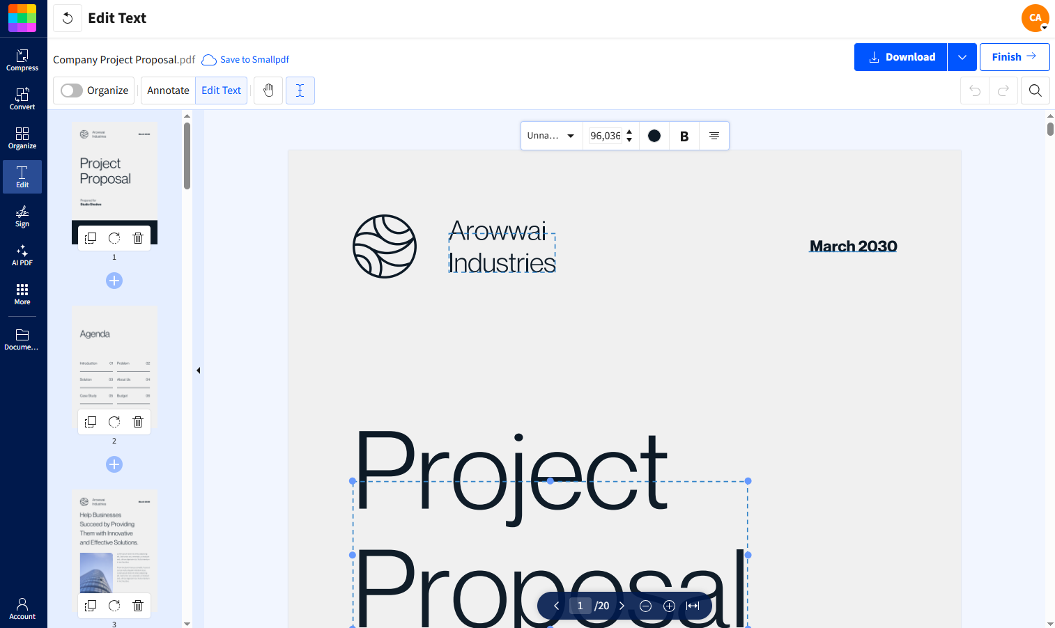
Click on any editable text to edit your PDF fonts, including the font style and size.
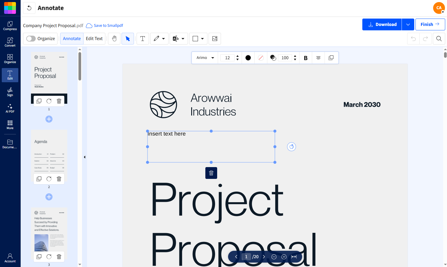
If the text can’t be edited, add a new text box and choose a font that matches your report.
Download the updated PDF or export it to share or print.
Because Smallpdf works directly in your browser, you can update fonts without installing software or rebuilding your document from scratch.
Editable PDFs let you make quick changes in seconds, while scanned files can be converted with OCR so text stays usable and consistent across pages. When you export, fonts are preserved for reliable sharing, printing, and viewing across devices, so reports look the same for every reader.
Start a free trial to access our full suite of PDF editing and formatting tools.
Frequently Asked Questions
What is the best font for reports?
Calibri is the best font for modern reports, offering excellent screen readability and professional appearance. For printed reports, Georgia provides classic elegance with superior legibility.What is the best font for real estate contracts?
Times New Roman and Garamond are excellent options for real estate contracts due to their formal and professional appearance.What is the best font for lease agreements?
Georgia and Times New Roman offer strong readability and clarity for lease agreements. For digital leases, try Open Sans.What is the best font for medical writing?
For professional medical writing, Times New Roman and Source Sans Pro are the best choices because they provide clarity and look professional.Which font is best for an offer letter?
The best font for an offer letter is one that looks professional and is easy to read. Common choices include Calibri, Times New Roman, Arial, and Georgia.What font is best for an eBook?
The best font for an eBook is one that’s highly readable across devices, such as Georgia, Palatino, or Brookerly. Serif fonts like these provide a comfortable reading experience for long-form text. For a modern look, clean sans-serif fonts like Arial or Roboto also work well.What is the best font for a formal invitation?
Fonts like Garamond, Candlescript, and Bodoni are classic choices for creating elegant and timeless formal invitations.What is the best font for a brochure?
Montserrat and Lato are versatile, highly-readable choices for any travel brochure.What is the best travel poster font?
Pair Oswald or Bebas Neue with bright visuals to make high-impact posters.Should I use different fonts for headings and body text?
You can use different fonts for headings and body text to create visual hierarchy but ensure they complement each other. Stick to the same font family or pair a sans serif heading with a serif body for best results.What font size is best for professional documents?
Use 11-12pt for print documents and 12-14pt for digital documents. Headings should be 14-18pt depending on hierarchy level.Are there free professional fonts available?
Yes, fonts like Arial, Calibri, and Georgia come pre-installed on most systems. Google Fonts also offers free professional options like Open Sans and Lora.Can I use decorative fonts in business documents?
Avoid decorative fonts in professional documents as they reduce readability and appear unprofessional. Save decorative typography for marketing materials or creative projects onlWhat’s the difference between a typeface and a font?
A typeface is the design (like Helvetica), while a font is a specific size and style of that typeface (like Helvetica Bold 12pt). In modern usage, the terms are often used interchangeably.How many fonts should I use in one document?
Limit yourself to one or two fonts maximum per document. Using too many fonts creates visual chaos and appears unprofessional.What font is best for documents that will be both printed and viewed digitally?
Georgia is ideal for dual-purpose documents as it’s a serif font designed for screen readability while maintaining excellent print quality. Calibri also works well for both formats.Prepare polished reports and cards on Smallpdf
Related Articles